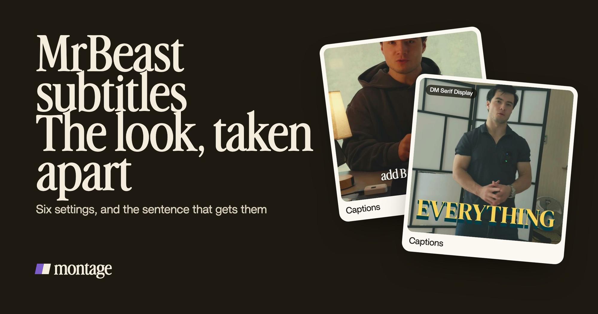
MrBeast subtitles:
the look, and how to get it.
Everybody wants the font. Truth is, the font is the easy part. Here's what the look is really made of, and the one sentence that gets it on your own video.
 Ben, founder of Montage · · 7 min read
In this post10 parts
- The short answer
- So what's the MrBeast font, really?
- What MrBeast subtitles are made of
- The whole look fits in one sentence
- How to make MrBeast subtitles, step by step
- Borrow the energy, keep your own look
- The edit around the captions
- MrBeast captions vs Hormozi captions
- Questions about MrBeast subtitles
- See it in real videos
The short answer.
Let's start with the answer, because that's what you came for.
MrBeast subtitles are the big, loud captions you see on his videos: a heavy display font, white words with a thick dark outline, the key word in a bright color, two or three words at a time, popping in at the center of the screen. The font people usually match it with is Komika Axis (storycut.com, kapwing.com). Bangers is the other close match (videocaptions.ai).
But here's the thing: his team has never published the font. And it matters less than you think. The look comes from six settings, not from one font file. Get the six right and you have it, in any tool.
If you're still choosing a typeface for your captions in general, start with how to pick a font for captions. Here, we take apart one look. In Montage, you can get it as captions in your own fonts and colors, asked for in one sentence.
One thing to be clear on: Montage isn't affiliated with MrBeast. His name is just what everybody calls this style.
So what's the MrBeast font, really?
Truth is, nobody outside his team knows.
The pages that rank for this search don't agree. storycut.com says the team hasn't published its fonts and that the look is « commonly matched » to Komika Axis. Kapwing's MrBeast template uses Komika Axis too. videocaptions.ai names Bangers as the closest match, and says the team works with « custom fonts and After Effects templates ».
So you'll find a font name, a « font generator », a download page. Fine. But put Komika Axis on your video in plain white, small, at the bottom, and it won't look like MrBeast at all. Do you see why?
The font is the easy part. The recipe is the look.
What MrBeast subtitles are made of.
Okay. Here's the look, taken apart. Six settings.
| Setting | What it does | The MrBeast way |
|---|---|---|
| Font | Sets the energy | A heavy, rounded display font: Komika Axis or Bangers are the usual matches |
| Edge | Keeps the words readable on any shot | A thick dark outline or a hard drop shadow |
| Color | Makes the important word jump | White words, the key word in a loud color: yellow, red, green |
| Size | Says what matters | The key word drawn bigger than the rest |
| Rhythm | Keeps the eye moving | Two or three words at a time, never a full sentence |
| Entrance | Gives each line a hit | A quick pop or scale-up as each line lands, centered on screen |
That's it. videocaptions.ai and storycut.com both give some version of this list. Kapwing's template, for example, uses a blue active word (#08B0D5) and a pink accent (#E3447C) instead of yellow. Same recipe, other colors.
And one more thing videocaptions.ai points out: the loud style is for the moments that need it, not every single line. That's their claim, not a measure, but it matches what you see. A video that shouts all the time stops being heard.
The whole look fits in one sentence.
Now, here's what none of the pages that rank show you: the look on a real video, not on a demo clip.
My short Way too curious (56 seconds, 9:16) was filmed too dark on an iPhone. For the captions, I asked for one thing: yellow, uppercase, a blue drop shadow, and the key word drawn bigger.
 Captions
It's not MrBeast's look, and it's not his font. But look at the recipe. A loud color. A dark edge. The word that matters, bigger. Three of the six settings, in one sentence. Boom.
So for the full MrBeast look on your own footage, the sentence is just a little longer:
« Captions in a heavy rounded font, white with a thick black outline, two or three words at a time, centered, the key word bigger and in yellow, each line popping in. »
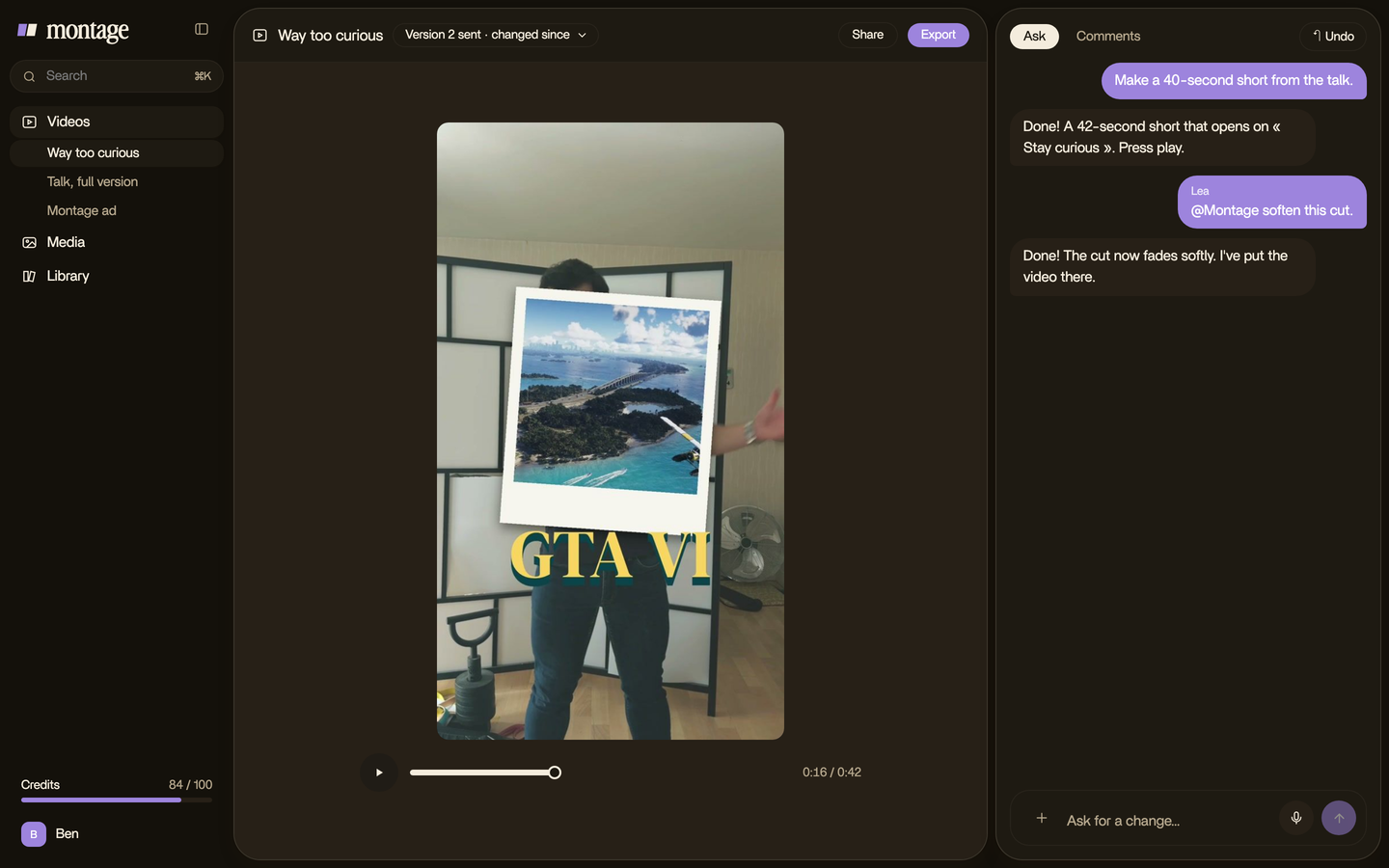
That's the whole job. No preset to hunt for, no inspector to click through. And if a line is off, you pause on it and say what's wrong. More on words that pop in and on other caption styles for video.
How to make MrBeast subtitles, step by step.
Here's how I'd do it.
- Pick the font. Komika Axis or Bangers if you want the closest match. Check the license of wherever you get it.
- Set the edge. A thick black outline or a hard shadow. Without it, white words vanish on a bright shot.
- Keep the words white, and choose one loud color for the key words.
- Make the key word bigger. One per line, the one you'd say louder.
- Cut the lines short. Two or three words at a time, as the pages that rank advise.
- Center them. Middle of the frame, not the bottom, so they sit where the eye already is.
- Add the pop. A quick scale-up on each line as it lands.
- Watch it once with the sound off. If you can follow the video, it works.
With a caption tool, steps 1 to 7 are settings you click. With an AI editor, they're the one sentence above. Pretty simple, right?
Borrow the energy, keep your own look.
In my opinion, borrow the energy, not the exact look.
Let me explain. This style is everywhere now. Copy it setting for setting, and your video looks like everyone else's. So keep the recipe (the edge, the loud key word, the short lines, the pop) and change the two things that make it yours: the font and the colors.
 Auto captionsEvery line on screen in my own font, timed to my voice.
 CaptionsOne line at a time, white on the take, dark on the white stage.
In How to be creative, every line on screen is in my own font, timed to my voice. In Edit it all with AI, the captions go one line at a time, white on the take, dark on the white stage. That's the edge setting at work: the color flips so the words always stand out from what's behind them.
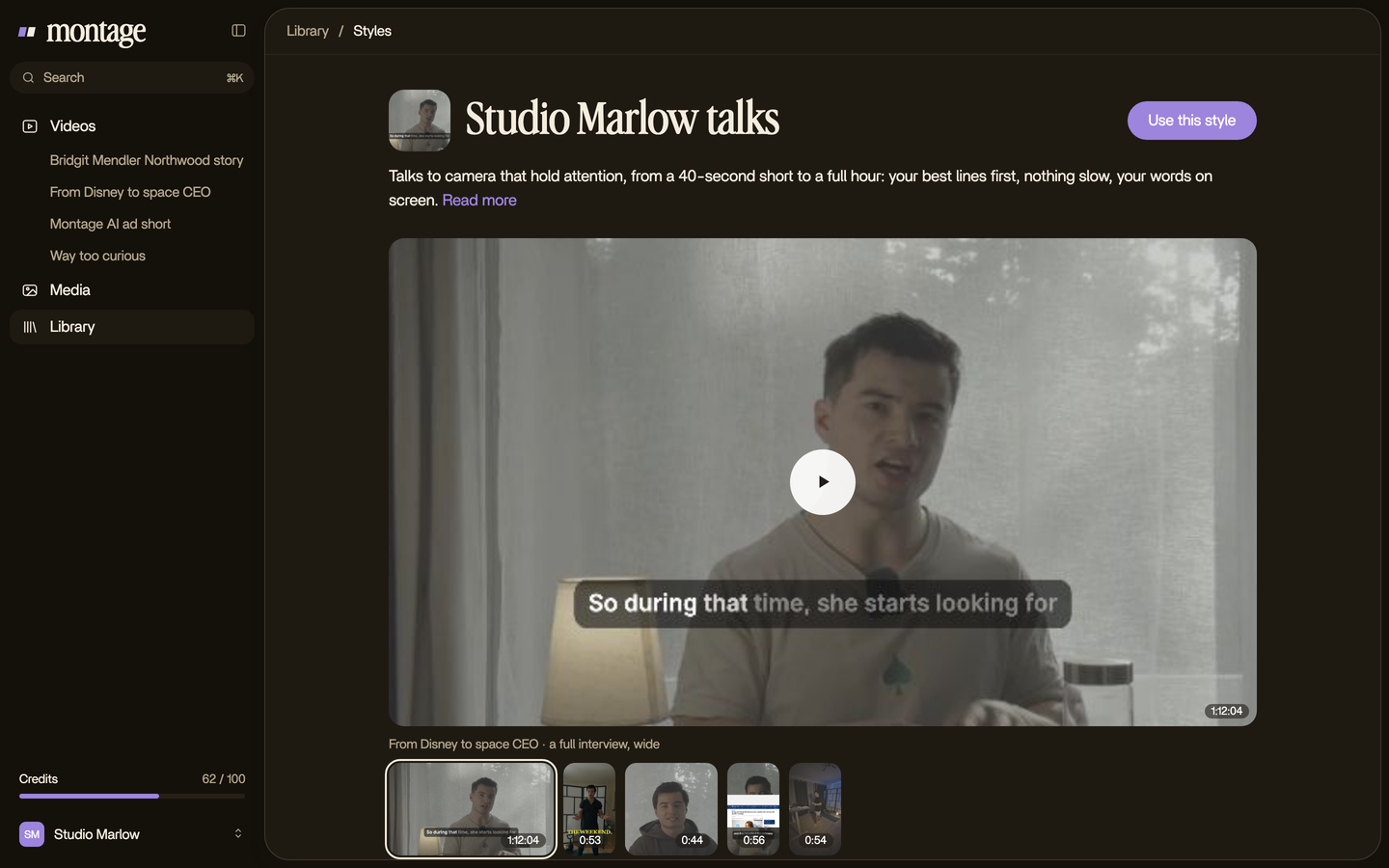
Then keep it. Once a look is right, save it as a style in the Library, and every next video gets it without asking again. That's how your brand's fonts and colors end up on every video, not just the one.
The edit around the captions.
Here's the thing: loud captions on a still, flat shot look stuck on. The edit around them has to move too.
 Zooms
In Way too curious, there's a slow push-in on every shot, and on « everything » and « curious » the picture pulls back on black. Loud captions plus punch-ins on the big lines: that's where the energy really comes from.
MrBeast captions vs Hormozi captions.
You'll often see the two side by side. Let's compare them.
| MrBeast style | Hormozi style | |
|---|---|---|
| Feel | Loud, playful, high energy | Cleaner, business-like (storycut.com) |
| Look | Heavy display font, thick outline, loud key words | Cleaner words on screen (storycut.com) |
Which one? Pick the one that sounds like you. Simple as that.
Questions about MrBeast subtitles.
How do I make MrBeast subtitles?
Use a heavy display font such as Komika Axis or Bangers, a thick dark outline, white words with the key word bigger and in
a loud color, two or three words at a time, centered, with a pop on each line. In Montage, you ask for all of it in one
sentence.
What is the MrBeast subtitle font?
His team has never published it. The look is most often matched with Komika Axis (storycut.com, kapwing.com), and
videocaptions.ai names Bangers as another close match.
How does MrBeast have custom subtitles?
His team makes them, with custom fonts and After Effects templates according to videocaptions.ai. You don't need either
to get the same recipe on your video.
How do I make MrBeast captions in Premiere Pro?
Premiere Pro can turn captions into a graphic layer (cinecom.net), so you can style them: a display font, a thick stroke,
a color on the key words. Then you animate the pop by hand, line by line.
What's the difference between MrBeast and Hormozi captions?
MrBeast captions are loud and playful. Hormozi captions are the cleaner, business-like cousin (storycut.com). Same idea,
big words on screen, a different energy.
For the platform side, see captions on YouTube and the TikTok caption font.
See it in real videos.
Every caption in this article comes from one of these four real videos.
 9:18
 2:07
 0:56
 0:38
That's it for this one. Now go make your words loud.
See you in the next one.