Font for captions:
how to pick one that reads.
Picking a font for captions takes a minute. Making it read on every shot takes four more choices. Let me show you both, with three real videos.
 Ben, founder of Montage · · 7 min read
In this post9 parts
The short answer.
Ladies and gentlemen, let's start with the answer, because that's what you came for.
The best font for captions is a bold, simple sans serif. Roboto, Montserrat, Inter or Atkinson Hyperlegible all work. Or your own font, if you have one. Then give it an outline or a shadow, so it reads on any shot.
That's the font. Now, here's the thing: the font is one choice out of five. The weight, the outline or shadow, the color against the shot, and the size with how many words sit on screen at once matter more for reading than the font itself.
Pick the font in a minute. The other four make it read.
In this guide: the fonts in one table, the four settings, and three real videos with their captions taken apart. If you want to see how Montage does it, here are captions in your own fonts and colors.
The best font for captions, in one table.
Okay. Here are the fonts that come up again and again in the guides that rank for this search, and what each one is good at.
| Font | Good for | Free? | Source |
|---|---|---|---|
| Roboto | Anything; it's YouTube's default subtitle font | Yes, a Google font | rev.com |
| Montserrat | Short vertical videos, bold and round | Yes, a Google font | reloop.so |
| Inter | Screen recordings and demos, very plain | Yes, a Google font | reloop.so |
| Atkinson Hyperlegible | Telling similar letters apart (I, l, 1) | Yes, a Google font | reloop.so (designed by the Braille Institute) |
| Noto Sans | Languages beyond the Latin alphabet | Yes, a Google font | reloop.so |
| Poppins | A friendly, brand look | Yes, a Google font | reloop.so |
| Helvetica, Arial | The classic look | Need a licence | reloop.so |
| Tiresias | Broadcast subtitles: it's the font of BBC subtitles | — | simonsaysai.com |
| Your own font | Captions that look like you, not like everyone | Yours | — |
So which one? In my opinion, your own font beats the default every time. If you don't have one, start with Roboto or Montserrat, and move on. You'll spend your time better on the next part.
 Auto captions
In How to be creative (2:07, 9:16), every line is on screen in my own font, timed to my voice. Not the app's default. Mine. That's the whole point of picking a font: the captions look like they belong to your video.
What makes a caption readable.
So what makes a caption readable? Let me explain.
A caption has a hard job. It sits on top of a moving picture that changes every few seconds: a bright window, a dark room, a white wall. And a lot of people watch with the sound off, so the captions carry the video. Any font can fail there. Here are the four settings that keep it from failing.
1. The weight
Thin fonts disappear on video. Use a medium, semibold or bold weight. The letters need enough body to stay solid when the picture behind them moves.
2. An outline or a shadow
This is the one most people skip. White text on a white shirt is gone. A thin dark outline or a drop shadow around the letters keeps them apart from whatever is behind. On dark footage, a colored shadow does the same job the other way around.
3. The color against the shot
White or yellow on a dark shot. Dark on a light one. The W3C's accessibility guideline asks for a contrast of at least 4.5:1 for normal text. On video you can't measure every frame, so the simple rule is: if the shot changes, the color can change with it.
4. The size, and how many words at a time
Big enough to read on a phone at arm's length. And short: one line at a time, or a few words. Two full lines at the bottom of a vertical video are hard to read and cover your face.
A plain font with the right four settings beats a beautiful font without them.
Three real videos, with their captions taken apart.
Every list of caption fonts shows the font as a sample, or on a demo. Let's look at captions on real videos instead, from first word to last.
Your own font: How to be creative
How to be creative (2:07, 9:16) has every line in my own font, timed to my voice. The lesson is simple: the font is part of your look, like your colors. Choose it once.
A shadow on dark footage: Way too curious
Way too curious (0:56, 9:16) was filmed too dark on an iPhone. So the captions had to work on a dark picture.
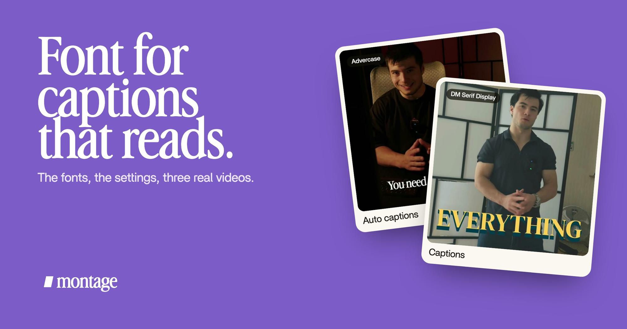
 CaptionsYellow, uppercase, a blue drop shadow, and the key word drawn bigger.
 CaptionsOne line at a time, white on the take, dark on the white stage.
What I asked for: yellow, uppercase, a blue drop shadow, and the key word drawn bigger. Yellow stands out on the dark shot. The shadow holds the letters together. And the bigger word tells you what matters in the sentence, even with the sound off. That's the stylish version, and it still reads.
A color that follows the background: Edit it all with AI
Edit it all with AI (0:38, 9:16) cuts between my take and a white stage. One caption color can't work on both. So the captions are one line at a time, white on the take, dark on the white stage.
Contrast is the point every list makes. Here's what it looks like on a real video. Do you see the difference?
Your font, once, as a style.
Here's how it works in Montage. You say it, in a sentence: « Add captions in my font. » The font can be your own, like the one in How to be creative.
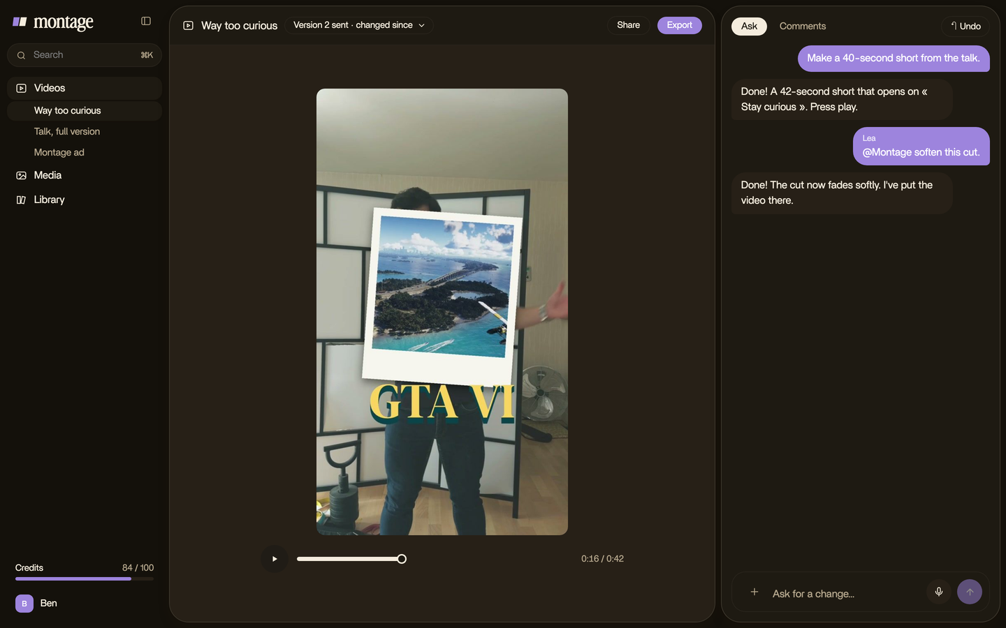
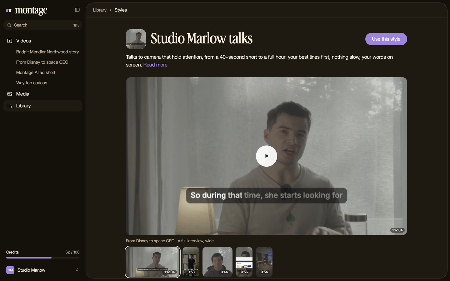
Then the whole look, the font, the color, the shadow, is kept as a style in the Library. The next video gets the same captions without choosing again. Same thing for your brand's fonts, colors and logo.
And if you want the words to move, pop in, or get highlighted, that's animated text, on top of the same font.
Fonts to avoid.
Let's be clear about what doesn't work on video:
- Thin and light weights. They vanish on any busy shot.
- Script and handwriting fonts. Pretty on a poster, slow to read in one second.
- Long sentences in all caps. Uppercase works for a few words, like in Way too curious. A full paragraph of it is tiring.
- No outline, no shadow. The best font in the world won't survive a white background.
Where to go next.
This page is the start of the captions guides. Each one goes deeper on one platform or one style:
- The font that's everywhere on short videos: the TikTok caption font.
- The big, bouncing, one-word-at-a-time look: MrBeast-style subtitles.
- Every look side by side: caption styles for video.
- Captions on YouTube, and how they work there.
- Adding captions on TikTok, step by step.
- Captioning a Facebook video.
- Captions on an Instagram Reel.
And if you're new to all of it, start with the beginner's guide to editing.
Questions about the font for captions.
What font should I use for captions?
A bold sans serif such as Roboto or Montserrat, or your own font. Then add an outline or a shadow, so it reads on any
shot.
What font looks like subtitles?
For online video, Roboto: it's YouTube's default subtitle font, according to rev.com. For the classic yellow film
subtitle, rev.com says it's often Helvetica Medium Italic.
What is a stylish font for captions?
Style comes less from the font than from what you do with it. Take a bold sans serif, then add a color, a shadow, and
one word bigger than the rest, like the yellow uppercase captions in Way too curious.
What is the CC font?
On YouTube, the closed captions use Roboto by default (rev.com).
What font does YouTube use for subtitles?
Roboto, by default (rev.com). If you burn your captions into the video yourself, you can use any font you like.
What about « copy and paste » caption fonts?
Those are Unicode « fancy text » for Instagram bios and post captions, not for the words on your video. Different thing.
See it in real videos.
Everything here comes from real videos, each one asked for in a sentence. Watch the captions on them, from start to finish.
 9:18
 2:07
 0:56
 0:38
That's it for this one. Now go pick your font, once.
See you in the next one.