Lower thirds:
what they are, with real examples.
A lower third is the little card that tells you who's talking or where a fact comes from. Here's what goes in one, what makes a good one, and one card used 26 times in a real video.
 Ben, founder of Montage · · 8 min read
In this post10 parts
The short answer.
Ladies and gentlemen, let's start with the answer.
Lower thirds are the text and graphics placed in the lower part of the screen to give the viewer more information. That's StudioBinder's definition, and it's the right one. A name, a job title, a source, a call to action.
You've seen thousands of them. The name and title under a person in an interview. The channel's handle in a corner of a YouTube video. The headline that says where a number comes from.
Now, here's the thing most guides miss. In a real video, a lower third isn't one graphic. It's the same graphic, over and over. In my 9-minute film, one card shows up 26 times. So the question isn't « which template? ». It's « how do I keep it the same every time? ». More on that below, and on how it's made with reusable components for YouTube.
Why they're called lower thirds.
So why « lower thirds »? Let me explain.
The name comes from TV. Broadcasters divided the screen into three horizontal bands, and the text went in the bottom one (Storyblocks). That's it.
But it doesn't have to sit exactly in that bottom third. StudioBinder says it clearly: the name is only where it comes from. Today a lower third can sit in a corner, a little higher, or on a card next to the speaker. What makes it a lower third is its job, not its position.
A lower third is a job, not a place on the screen.
What goes in a lower third.
StudioBinder and Vimeo agree on five elements. Every lower third is built from them.
- Typography: the font, its size, its weight. A big name, a smaller title under it.
- Color: your brand's colors, with enough contrast to read over any picture.
- Shapes and graphics: a bar, a box, a logo, a frosted panel.
- Animation: how it comes in and goes out. A slide, a fade, a text animation that writes it on.
- Size and position: where it sits on the frame, and how much room it takes.
Get those five the same every time, and you have a style. Change them from one appearance to the next, and the video looks like it was made by five people.
The four kinds of lower thirds graphics.
Vimeo lists four uses. Here they are, with what each one says, and a real card for three of them.
| Kind | What it says | An example |
|---|---|---|
| Name | Who's talking: a name, a job title | The classic one: the speaker's name in an interview |
| Information | Where a fact comes from, or what chapter you're in | The media card in From Disney star to space CEO: a picture or a clip, its caption |
| Call to action | What to do next: subscribe, scan, use a code | The sponsor card with the QR code and the code BLG |
| Captions | What's being said, word for word | The yellow captions in Way too curious |
Captions as a lower third? Yes. Vimeo counts captions and translations as one, for accessibility. And on a vertical video, they're often the only text on screen.
Lower thirds examples from a real video.
Okay. Let's look at real ones. Not a template gallery. Cards from real videos.
The information card, used 26 times
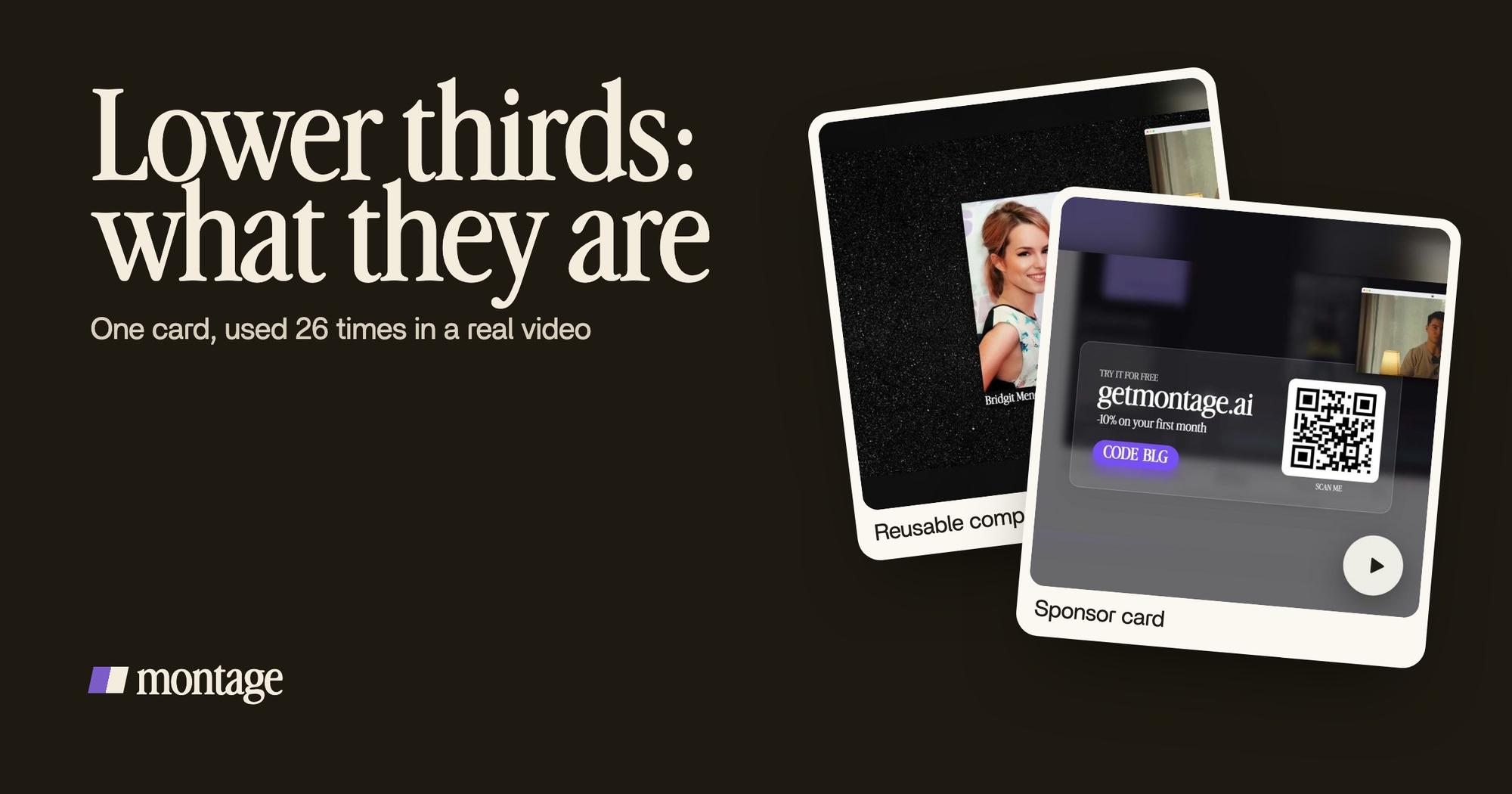
From Disney star to space CEO is a founder's long-form YouTube film, 9 minutes and 18 seconds. It has one media card: a picture or a clip, its caption, on the dark page. One card. Used 26 times.
 Reusable componentsOne media card, used 26 times: a picture or a clip, its caption, on the dark page. Click to watch it.
 Motion designA real headline, highlighted in yellow while I read it. Click to watch it.
Next to it: a real headline, highlighted in yellow while I read it. Same job. It tells you where the fact comes from, right when you hear it.
The guides tell you to keep one style through your project (Storyblocks says exactly that). This is what it looks like. Twenty-six appearances, and every one is the same card.
Make it once. Use it everywhere.
The call to action: the sponsor card
Vimeo's third use is branding and calls to action, the « like and subscribe » kind. In the same film, the sponsor gets its own card: frosted glass, the QR code and the code BLG. It's a component made for the sponsor, not a template dropped on top.
 Sponsor card
Captions: the lower third of a vertical video
Way too curious is a 56-second vertical video. Its captions are yellow, uppercase, with a blue drop shadow, and the key word drawn bigger.
 Captions
Do you see the drop shadow? That's the readability rule Vimeo gives: contrast, or a drop shadow, so the words read over any picture. Here's how captions in your own font work in Montage.
What makes a good lower third?
Here's my opinion. A good lower third is the one that's the same every time it appears, and is gone before you notice it. You read it, you get it, it leaves. If people remember the lower third more than what you said, it's too much.
Sure. But there are real rules behind that, and the guides that rank all give them. Here they are, with their sources.
| Rule | Why | Source |
|---|---|---|
| Short text | A name and a title, not a sentence | Vimeo, StudioBinder |
| Legibility first | « Legibility trumps creativity » | Storyblocks |
| Contrast or a drop shadow | So it reads over any picture | Vimeo |
| Inside the safe area | Margins, so nothing gets cut off at the edges | Vimeo, StudioBinder, Storyblocks |
| A clear hierarchy | Big name, smaller title | Storyblocks |
| On brand | Your fonts and colors | StudioBinder, Vimeo |
| Subtle animation | It comes in and goes out, it doesn't perform | Vimeo |
| The right timing | Long enough to read, no longer | Vimeo |
| Never over what matters | Don't cover what the viewer needs to see | StudioBinder |
| One style per project | The same card every time | Storyblocks |
And sizes? Vimeo gives these for a 1080p video: speaker labels 960 × 240 pixels, captions 1,280 × 240, chapter titles 1,280 × 480, calls to action 480 × 480.
Legibility first. Then the look.
How to make a lower third.
There are two ways. Let's be honest about both.
With a template pack
You download a template and drag it onto your timeline. Mixkit alone has 71 free Premiere Pro templates for lower thirds. Envato, Uppbeat and Storyblocks sell more, for Premiere, After Effects, DaVinci Resolve and Motion.
If you already work in one of those programs, that's a good route. You pick one, change the text, place it. Then you place it again for the next appearance. And again.
By describing it once
The other way is the one I used. You describe the card once: what's in it, your font, your colors, how it comes in. Montage makes it as a component. Every time it appears after that, it's the same card, because it is the same card.
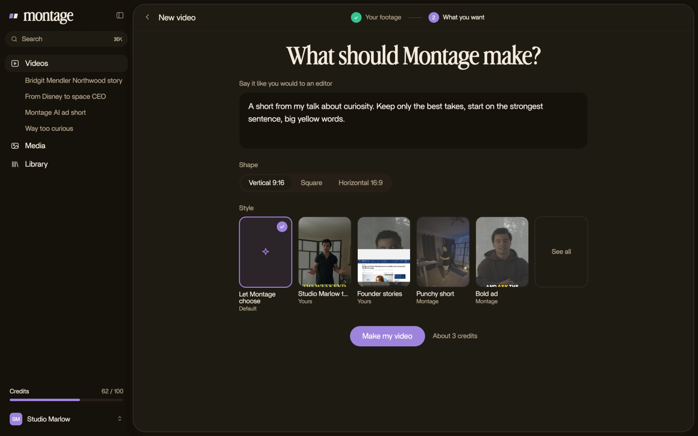
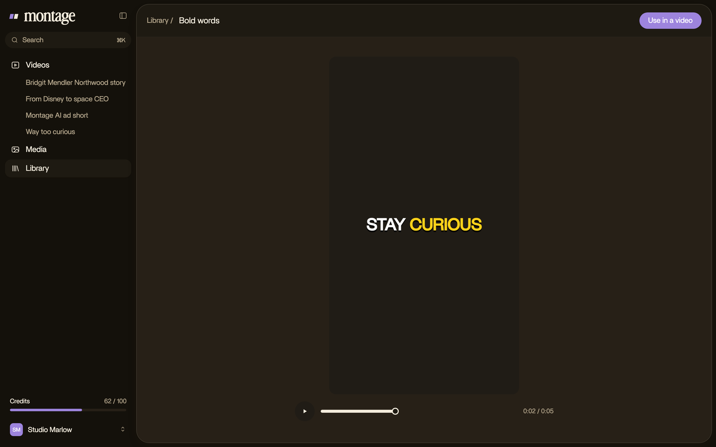
And when one appearance is wrong, you pause, comment on it, and that one gets fixed. You don't place 26 cards by hand. Your fonts, colors and logo stay the same from one video to the next.
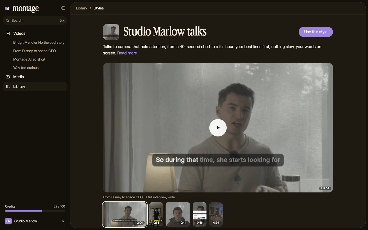
Which one is for you? If you live in Premiere or After Effects, a template pack is fine. If you'd rather say what you want and watch it, describe it. Simple as that.
Where lower thirds fit in motion design.
Lower thirds are one part of motion design: the graphics that move in your video. Here's the rest of it, each with its own guide.
- Text animation: how words come in, move and leave. Start with animated text in a video.
- Typing text: the words appear letter by letter, like someone's typing. Here's a typing text animation, step by step.
- Transitions: what happens between two shots. The guide to transitions for video.
- Motion graphics: the cards, titles and moving pictures of a YouTube video. Everything on motion graphics for YouTube.
And if you just want words that move, here's animated text, made by asking.
Lower thirds: your questions.
What does lower thirds mean?
Lower thirds are the text and graphics placed in the lower part of a video to give more information: a name, a title, a
source, a call to action, or captions.
Why are they called lower thirds?
Because TV divided the screen into three horizontal bands, and the text went in the bottom one. Today a lower third
doesn't have to sit exactly there.
How do I do a lower third?
Two ways. Download a template and drag it onto your timeline in Premiere, After Effects or Resolve. Or describe the card
once in an AI editor like Montage, which makes it as a component and uses the same card every time.
What makes a good lower third?
Short text, easy to read over any picture, inside the safe area, on brand, and the same every time it appears. In my
opinion, the best one is gone before you notice it.
What size should a lower third be?
For a 1080p video, Vimeo suggests 960 × 240 pixels for a speaker label, 1,280 × 240 for captions, 1,280 × 480 for a
chapter title, and 480 × 480 for a call to action.
See it in a real video.
Every card in this guide is from a real video. Watch the 9:18 film and count the media card yourself. New to all this? Start with video editing for beginners.
 9:18
 2:07
 0:56
 0:38
That's it for this one. Now go name your first guest.
See you in the next one.